Slaying Pixels: Our Philosophy to Design
Design Philosophy
Getting into the right frame of mind for slaying pixels at Fullscript
Boiling Down
This should always be top of mind; nobody wants a watery sauce. If the solution to a problem we’re trying to tackle has to be explained by an on-boarding, modal, overlay, or loads of text, you’ve probably missed the mark. Take a step back, let it simmer, and it will boil down.
Well-thought design simply disappears – it just gets out of the way. True intuitive design takes serious self-discipline – it's easy to get carried away with vanity and lose focus of the task at hand; whether that be a marketing CTA, a take-away metric, or a primary action. This is what we strive for at Fullscript.
Prioritization
Startups are inherently a continuous forest fire for the small design department they rely on. Designers must decide which fire is raging most, run to that fire and help put it out as best as they can, as quickly as they can. No fire is the same, and the fire could spread, so they need to adapt to each fire. They are also expected to partially manage the fire fighting team once they arrive – and coordinate their tactics for fighting fires with their fellow designers. That's a lot of shit to juggle.
Analogy aside, designers at Fullscript aid every part of the business which sometimes makes prioritization very difficult. Use critical thinking and keep milestones or our current product swim-lanes (practitioner, patient, integration, growth) in mind when deciding what to spend your time on. Don’t let last-minute projects continue to come in from the same department or people. We never turn away a project solely on when in a project cycle we receive it, but make sure it’s known that the more heads up we have for a project, the better the outcome as we then have the capacity to make it shine.
Data vs Gut
Whenever humanly possible, we are driven by data in our design. We refer to this guide on the regular and add to it when something is missing. Assumptions will get you in hot water at some point, sometimes it just takes awhile for it to get up to temp – avoid them at all costs.
Since we are designing the future of healthcare, we are often on the bleeding edge and in uncharted territory. No Google search or Dribbble post will give you an idea of what is the norm, or act as a guide in best practice. In this situation we are forced to rely on our gut. A gut call is an educated guess, but it is never an excuse to avoid asking questions to skip user experience research (UXR).
Role Importance
We don’t place one role on a pedestal over another as they are all part of the same funnel – just at different stages. Nailing visual design widens the prospect funnel and can engage leads; nailing UX design can onboard and retain those leads, converting them to users; nailing UI design can lead to a long tail of user engagement. We all have a part to play to strengthen every part of our funnel. Mastering and owning your part of the funnel and improving it will help us push the boulder, and help you achieve your career goals.
Content First
As a general rule of thumb, don’t use lorem ipsum! If you find yourself having to use it for more than one small blurb, you’re probably ahead of yourself and need to jump back to planning, ask for further copy from your PM, or jump in to some copywriting yourself (should you feel confident to do so). Still struggling? The section is probably not worth keeping.
Always place the CTA or primary copy first, and build your design from there. There is so much we can do with type to shape an emotional response, or create visual hierarchy. Graphical, illustrative, and iconographic elements are meant to be supporting roles to copy. So unless your image can actually say exactly what you want to convey to the end user, start with copy and build from there.
Mobile First
Starting a design off with a mobile first mentality will help in deciding in what is important and what is not. It sets us up well for the future, as this percentage is climbing year over year. It also helps us easily expand to emerging markets down the road, where mobile traffic is even higher than 50%.
Design Systems
Marketing is always running digital campaigns, sometimes popping open photoshop, visiting conferences; and a videographer doing motion graphics on top. Front-end developers are hungry for standardized colours, fonts, buttons, and form elements for use throughout our products. Talent and Culture is creating and hosting events. Execs want to make sure their presentations visually match the platform. We have team emails, internal tools, and recruiting events.
Our brand guide advises it all. Building tools like it are never a waste of time. If it helps others do their work faster, better, or delivers consistency across the company, it’s a multiplier.
Tools of the Trade
You’ll need to set up the following to get started.
Sketch
Prototyping designs; Final mockups; UI kit
Invision
Design commenting; Project management
Adobe CC
Photoshop; Illustrator; Sofia Font Family
Font Awesome
7,020 icons like the ones on this page
Craft
Sync between Sketch and Invision
Digital Color Meter
Grab colors anywhere on your screen
GitLab
Development QA; Bug Reporting
Trello
Project management; Team comms
Product Board
Product roadmap; ideas; feature requests
Brand Guide & UI Kit
Our Bibles – we refer to them daily
SkyFonts
Syncing Google Fonts
Slack
#PixelSlayers & #DesignPigeons
Process
Larger Projects
Understand the objectives; answer the questions:
- What problem are we solving?
- Who has this problem?
- What do we want to achieve?
Become the subject matter expert.
- Has someone solved this problem before?
- User interviews
- Surveys & market research
Sketch and wireframe lots of ideas, quickly.
- Storyboarding / user journey (flow chart)
- Information architecture
- Sketch/Adobe XD is fine, but not pixel perfect
Focus your efforts – may shoot you back to step 3.
- Make full use of Sketch & Invision
- User testing (internal/external)
- Start looping in devs
Get it pixel perfect and ready for presenting.
- An organized, symbolized sketch file
- Complete Invision prototype
- Update A3 of expected visuals
Our involvement doesn't end with the demo at dev kickoff.
- Be available for dev questions
- Gitlab QA nearing launch
- Follow up with results after launch
Smaller Projects
Sometimes there just isn’t enough time to go through a long process. For a smaller project, the steps above may be overkill and cumbersome, so on smaller projects we jump in as fast as possible. Typically this means hopping straight in to Step 3 or 4. We still make sure it is shared on our Google Drive team folder and go through at least one round of peer feedback via Invision before shipping it.
Sprints
Every so often a design challenge comes along that is far less defined than usual. It requires a brainstorm as a team to kick it off – a design sprint. Here at Fullscript we have adopted a 4-day process:
Day 1 – Sponge mode
Understand the problem; sketch it out
Day 2 – Decide on direction
Impact vs effort; user flows
Day 3 – Protoyping
Primary designer runs with it
Day 4 – Demo
Present demo; retrospective; next steps
A note on problem solving
Being confident means asking the right questions, and being data-informed (see Data vs Gut); but it can also means that when you don’t, you are able to iterate, test, then choose the best route instead of designing in circles. Be willing to toss out an idea if it leads to a dead end. Strong opinions, loosely held.
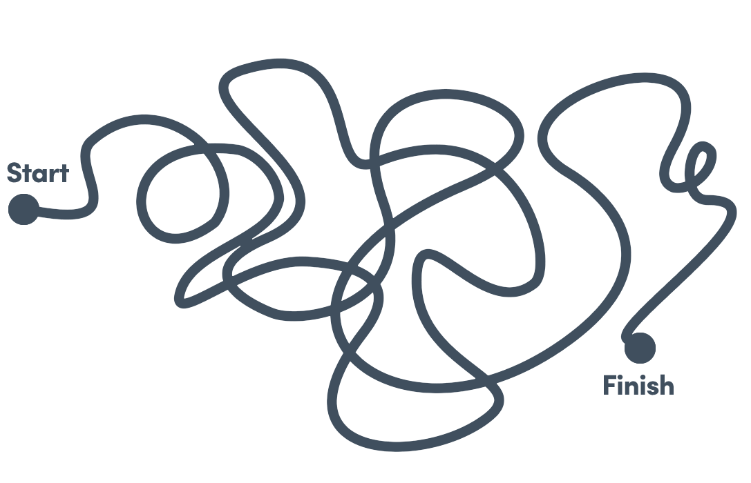 The process of a junior designer – holding dearly to concepts and as a result, designing in circles.
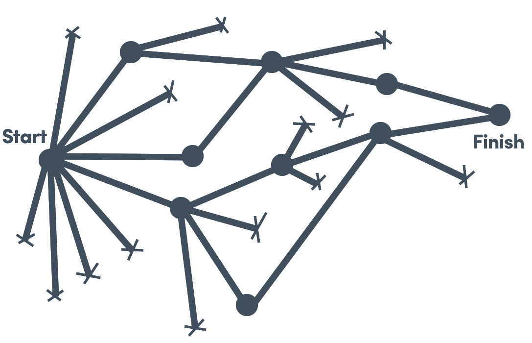 The process of a senior designer – ideating; testing; failing and tossing; and moving on confidently.
Culture Ideals
We lead by example and support all other departments
Leadership
– Suzanne Labarre, Fast Co. Read article
Have you ever met a talented designer that wants to live in a continuous design dictatorship; who wants to be a minion entirely for someone else, pushing pixels until the end of their days? This approach could bring designers on par with each other in terms of skill and inspiration, but could also breed churn and stifle creativeness.
Likewise, have you ever met talented designer that loves to design by committee? The result of design by committee is brown, always brown. Nobody likes brown. That being said, when it comes to decision making before going into design, we all make better decisions when we make them as a team – so don’t hesitate to ask.
Fullscript strives to live somewhere in between. A happy medium where we all follow shared rules, but also take turns creating or editing the rule book. Meritocracy – leading by example, in design or otherwise, is always the path to success.
Team structure
Whether a designer is focusing on work for Marketing, Practitioner Product, Patient Product, Internal Tools / CS, Integrations, Data, or Talent & Culture, they will have a team, framework, and structure to look to for design support.
For a company to give their creatives the freedom to be as specialized as they would like to be is a major draw for design candidates that bleed the edges of departments, are fresh from school, are deeply experienced in a specific skillset, or just like to move around for variety. We actively encourage you to speak up if you’re feeling like you are burnt out, are in a creative rut, or could just use a shift from your swim-lane or project. Time is your greatest asset to give – lets make sure we are utilizing it the best we can.
Brand Guide